1.emmet语法
1.1 简介
Emmet语法的前身是Zen coding,它使用缩写,来提高html/css的编写速度, Vscode内部已经集成该语法。
快速生成HTML结构语法
快速生成CSS样式语法
1.2 快速生成HTML结构语法
- 生成标签直接输入标签名按
tab键即可。比如div然后tab键,就可以生成<div></div> - 如果想要生成多个相同标签加上
*就可以了。比如div*3就可以快速生成3个div - 如果有父子级关系的标签,可以用
>。比如ul > li就可以了 - 如果有兄弟关系的标签,用
+就可以了。比如div+p - 如果生成带有类名或者id名字的,直接写
.demo或者#twotab 键就可以了。默认生成的是div标签,如果想生成其他标签,比如p标签就写p.demo,就生成了一个p标签类为demo的标签 - 如果生成的div类名是有顺序的,可以用自增符号
$。示例p.demo$*5 - 如果想要在生成的标签内部写内容可以用
{ }表示。示例div{5}或div{$}*5
1.3 快速生成CSS样式语法
CSS 基本采取简写形式即可
- 比如
w200按tab可以生成width: 200px; - 比如
lh26px按tab可以生成line-height: 26px;
1.4 快速格式化代码
Vscode快速格式化代码: shift+alt+f
也可以设置当我们保存页面的时候自动格式化代码:
- 文件 ------>【首选项】---------->【设置】;
- 搜索emmet.include;
- 在settings.json下的【工作区设置】中添加以下语句:
"editor.formatOnType": true,
"editor.formatOnSave": true
2.CSS的复合选择器
2.1 什么是复合选择器
- 在CSS中,可以根据选择器的类型把选择器分为基础选择器和复合选择器,复合选择器是建立在基础选择器之上,对基本选择器进行组合形成的。
- 复合选择器是由两个或多个基础选择器,通过不同的方式组合而成的,可以更准确、更高效的选择目标元素(标签)
- 常用的复合选择器包括:后代选择器、子选择器、并集选择器、伪类选择器等等
2.2 后代选择器
后代选择器又称为包含选择器,可以选择父元素里面子元素。其写法就是把外层标签写在前面,内层标签写在后面,中间用空格分隔。当标签发生嵌套时,内层标签就成为外层标签的后代。
语法:
元素1 元素2 { 样式声明 }上述语法表示选择元素 1 里面的所有元素 2 (后代元素)。
示例:
<!DOCTYPE html>
<html lang="en">
<head>
    <meta charset="UTF-8">
    <meta name="viewport" content="width=device-width, initial-scale=1.0">
    <title>Document</title>
    <style>
        ul li {
            color: pink;
        }
        .nav li {
            color: #6b1212;
        }
        .nav li a {
            color: #df16aa;
        }
    </style>
</head>
<body>
    <ol>
        <li>后代选择器ol li</li>
        <li>后代选择器ol li</li>
        <li>后代选择器ol li</li>
        <li>后代选择器ol li</li>
    </ol>
    <ul>
        <li>后代选择器ul li</li>
        <li>后代选择器ul li</li>
        <li>后代选择器ul li</li>
        <li>后代选择器ul li</li>
    </ul>
    <ul class="nav">
        <li>后代选择器ul li</li>
        <li>后代选择器ul li</li>
        <li>后代选择器ul li</li>
        <li><a href="#">a标签</a></li>
    </ul>
</body>
</html>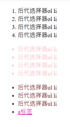
语法说明:
- 元素1 和 元素2 中间用空格隔开
- 元素1 是父级,元素2 是子级,最终选择的是元素2
- 元素2 可以是儿子,也可以是孙子等,只要是元素1 的后代即可
- 元素1 和 元素2 可以是任意基础选择器
2.3 子选择器
子元素选择器(子选择器)只能选择作为某元素的最近一级子元素。
(简单理解就是选亲儿子元素)
语法:
元素1>元素2 {样式声明}上述语法表示选择元素1 里面的所有直接后代(子元素) 元素2。
示例:
<!DOCTYPE html>
<html lang="en">
<head>
    <meta charset="UTF-8">
    <meta name="viewport" content="width=device-width, initial-scale=1.0">
    <title>Document</title>
    <style>
        div>a {
            color: pink;
        }
    </style>
</head>
<body>
    <div>
        <a href="#">我是儿子</a>
        <p>
            <a href="#">我是孙子</a>
        </p>
    </div>
</body>
</html>
语法说明:
- 元素1和元素2中间用
>隔开 - 元素1是父级,元素2是子级,最终选择的是元素2
- 元素2 必须是亲儿子,其孙子、重孙之类都不归他管。你也可以叫他亲儿子选择器
2.4 并集选择器
并集选择器可以选择多组标签, 同时为他们定义相同的样式,通常用于集体声明。并集选择器是各选择器通过英文逗号,连接而成,任何形式的选择器都可以作为并集选择器的一部分。
语法:
元素1,元素2 {样式声明}上述语法表示选择元素1 和 元素2。
<!DOCTYPE html>
<html lang="en">
<head>
    <meta charset="UTF-8">
    <meta name="viewport" content="width=device-width, initial-scale=1.0">
    <title>Document</title>
    <style>
        div,p,ul>ol {
            color: pink;
        }
    </style>
</head>
<body>
    <div>
        <div>熊大</div>
        <p>熊二</p>
        <span>光头强</span><br>
        <a href="#">孙悟空</a>
        <ul>
            <ol>小猪佩奇</ol>
            <ol>猪妈妈</ol>
            <ol>猪爸爸</ol>
        </ul>
    </div>
</body>
</html>
语法说明:
- 元素1 和 元素2 中间用逗号隔开
- 逗号可以理解为和的意思
- 并集选择器通常用于集体声明
2.5 伪类选择器
伪类选择器用于向某些选择器添加特殊的效果,比如给链接添加特殊效果,或选择第1个,第n个元素。
伪类选择器书写最大的特点是用冒号(:)表示,比如 :hover 、 :first-child 。
2.5.1 链接伪类选择器
作用是给链接添加特殊效果。
语法:
| 伪类选择器 | 说明 | 示例 |
|---|---|---|
| :link | 选择所有未被访问的链接 | a:link |
| :visited | 选择所有已被访问的链接 | a:visited |
| :hover | 选择鼠标指针位于其上的链接 | a:hover |
| :active | 选择活动链接(鼠标按下未弹起时) | a:active |
<!DOCTYPE html>
<html lang="en">
<head>
    <meta charset="UTF-8">
    <meta name="viewport" content="width=device-width, initial-scale=1.0">
    <title>Document</title>
    <style>
        /* 选择所有未被访问的链接 */
        a:link {
            color: red;
        }
        /* 选择所有已被访问的链接 */
        a:visited {
            color: yellow;
        }
        /* 选择鼠标指针位于其上的链接 */
        a:hover {
            color: blue;
        }
        /* 选择活动链接(鼠标按下未弹起时) */
        a:active {
            color: green;
        }

    </style>
</head>
<body>
    <a href="#7">链接伪类选择器示例1</a><br>
    <a href="#8">链接伪类选择器示例2</a><br>
    <a href="#9">链接伪类选择器示例3</a><br>
    <a href="#10">链接伪类选择器示例4</a>
</body>
</html>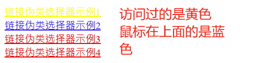
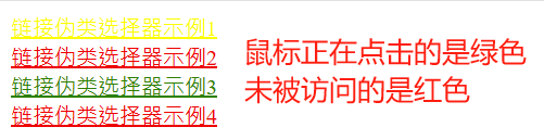
注意事项:
- 为了确保生效,请按照
LVHA的循顺序声明 :link-:visited-:hover-:active。 - 记忆法:love hate 或者 lv 包包 hao 。
- 因为 a 链接在浏览器中具有默认样式,所以我们实际工作中都需要给链接单独指定样式。
<!--a是标签选择器 选择所有a标签加上灰色样式 并且将下划线去掉-->
a {
   color: gray;
    text-decoration: none;
}
<!--使用链接伪类选择器 鼠标经过的时候变成蓝色-->
a:hover {
   color: blue;
}
2.5.2 焦点伪类选择器
:focus伪类选择器用于选取获得焦点的表单元素。
焦点就是光标,一般情况<input> 类表单元素才能获取
<!DOCTYPE html>
<html lang="en">
<head>
    <meta charset="UTF-8">
    <meta name="viewport" content="width=device-width, initial-scale=1.0">
    <title>Document</title>
    <style>
        input:focus {
            background-color: pink;
            color: red;
        }
    </style>
</head>
<body>
    <input type="text"></input>
    <input type="text"></input>
    <input type="text"></input>
</body>
</html>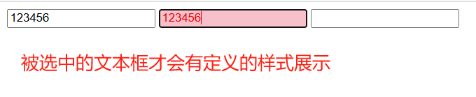
2.6 复合选择器总结
| 选择器 | 作用 | 特征 | 使用情况 | 隔开符号及用法 |
|---|---|---|---|---|
| 后代选择器 | 选择后代元素 | 可以是子孙后代 | 较多 | 空格 .nav a |
| 子选择器 | 选择最近一级子元素 | 只选亲儿子 | 较少 | > div>p |
| 并集选择器 | 选择多组标签 | 集体声明相同样式 | 较多 | , div,p,ul>li |
| 链接伪类选择器 | 给链接添加特殊效果 | 按LVHA顺序 | 较多 | : a:hover |
| :focus选择器 | 选择获得光标的表单 | 主要针对input表单 | 较少 | : input:focus |
3.CSS的显示模式
3.1 什么是元素的显示模式
元素显示模式就是元素(标签)以什么方式进行显示,比如<div>自己占一行,比如一行可以放多个<span>。
网页的标签非常多,在不同地方会用到不同类型的标签,了解他们的特点可以更好的布局我们的网页。
HTML元素一般分为块元素和行内元素两种类型。
3.2 元素显示模式的分类
3.2.1 块元素
常见的块元素<h1>-<h6>、<p>、<div>、<ul>、<ol>、<li>。
块级元素特点:
- 比较霸道,自己独占一行
- 高度、宽度、外边距以及内边距都可以控制
- 宽度默认是容器父级宽度的100%
- 是一个容器及盒子,里面可以放行内或者块级元素
<!DOCTYPE html>
<html lang="en">
<head>
    <meta charset="UTF-8">
    <meta name="viewport" content="width=device-width, initial-scale=1.0">
    <title>Document</title>
    <style>
        div {
            width: 100px;
            height: 100px;
            background-color: pink;
        }
    </style>
</head>
<body>
    <div>我是div</div> 我是div之外的元素
</body>
</html>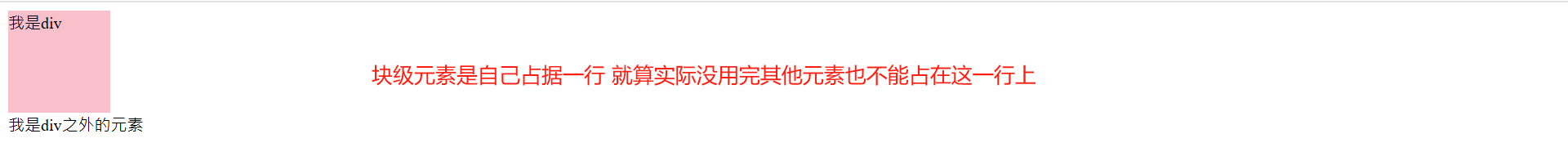
注意:
文字类的元素内不能放块级元素<p> 标签主要用于存放文字,因此 <p> 里面不能放块级元素,特别是不能放<div>
同理,<h1>~<h6>等都是文字类块级标签,里面也不能放其他块级元素
<!DOCTYPE html>
<html lang="en">
<head>
    <meta charset="UTF-8">
    <meta name="viewport" content="width=device-width, initial-scale=1.0">
    <title>Document</title>
    <style>
        div {
            width: 100px;
            height: 100px;
            background-color: pink;
        }
    </style>
</head>
<body>
    <p>我是p标签<div>我是div</div></p>

</body>
</html>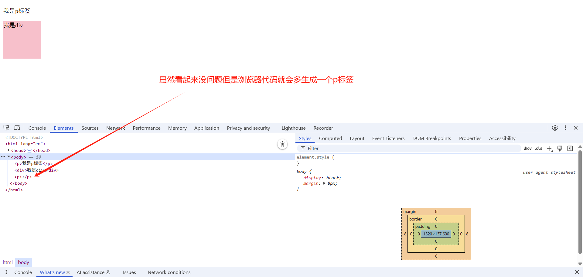
3.2.2 行内元素
<a>、<strong>、<b>、<em>、<i>、<del>、<s>、<ins>、<u>、<span><span> 标签是最典型的行内元素。有的地方也将行内元素称为内联元素。
行内元素的特点:
- 相邻行内元素在一行上,一行可以显示多个。
- 高、宽直接设置是无效的。
- 默认宽度就是它本身内容的宽度。
- 行内元素只能容纳文本或其他行内元素。
<!DOCTYPE html>
<html lang="en">
<head>
    <meta charset="UTF-8">
    <meta name="viewport" content="width=device-width, initial-scale=1.0">
    <title>Document</title>
    <style>
        span {
            width: 100px;
            height: 100px;
            background-color: pink;
        }

    </style>
</head>
<body>
    <span>第一个行内元素1111111</span><strong>第二个行内元素</strong><span>第三个行内元素</span><strong>第四个行内元素</strong>
</body>
</html>
注意事项:
- 链接里面不能再放链接
- 特殊情况链接
<a>里面可以放块级元素,但是给<a>转换一下块级模式最安全
3.2.3 行内块元素
常见的行内块标签:<img />、<input />、<td>
它们同时具有块元素和行内元素的特点。有些资料称它们为行内块元素。
行内块元素的特点:
- 和相邻行内元素(行内块)在一行上,但是他们之间会有空白缝隙。
- 一行可以显示多个(行内元素特点)。
- 默认宽度就是它本身内容的宽度(行内元素特点)。
- 高度、行高、外边距以及内边距都可以控制(块级元素特点)。
<!DOCTYPE html>
<html lang="en">
<head>
    <meta charset="UTF-8">
    <meta name="viewport" content="width=device-width, initial-scale=1.0">
    <title>Document</title>
    <style>
        input {
            width: 250px;
            height: 50px;
            background-color: pink;
        }

    </style>
</head>
<body>
    <input type="text">
    <input type="text">
</body>
</html>
3.2.4 元素显示模式总结
| 元素模式 | 特点 | 常见标签 |
|---|---|---|
| 块级元素 | 独占一行,可设置宽高,默认宽度100%,可包含行内或块级元素 | <div>,<p>,<h1>-<h6>,<ul> |
| 行内元素 | 一行显示多个,不可设置宽高,默认宽度为内容宽度,只能容纳文本或行内元素 | <span>,<a>,<strong> |
| 行内块元素 | 一行显示多个但有空隙,可设置宽高,默认宽度为内容宽度 | <img>,<input>,<td> |
3.3 元素显示模式的转换
一个模式的元素需要另外一种模式的特性
比如想要增加链接 <a> 的触发范围。
转换方式:
| 转换方式 | 描述 | 示例代码 |
|---|---|---|
| display: block | 将元素转换为块级元素 | a { display: block; } |
| display: inline | 将元素转换为行内元素 | div { display: inline; } |
| display: inline-block | 将元素转换为行内块元素 | span { display: inline-block; } |
<!DOCTYPE html>
<html lang="en">
<head>
    <meta charset="UTF-8">
    <meta name="viewport" content="width=device-width, initial-scale=1.0">
    <title>Document</title>

    <style>
        a {
            width: 100px;
            height: 100px;
            background-color: pink;
            display:block;
        }

        div {
            width: 100px;
            height: 100px;
            background-color: rgb(219, 8, 43);
            display:inline;
        }
        span {
           width: 100px;
            height: 100px;
            background-color: rgb(23, 79, 209);
            display: inline-block;
        }

    </style>

</head>
<body>
    <a href="#">a标签行内元素转换成块元素</a>
    <a href="#">a标签行内元素转换成块元素</a>

    <div>div块元素转换成行内元素</div>
    <div>div块元素转换成行内元素</div>

    <span>span行内元素转换成行内块元素</span>
    <span>span行内元素转换成行内块元素</span>
</body>
</html>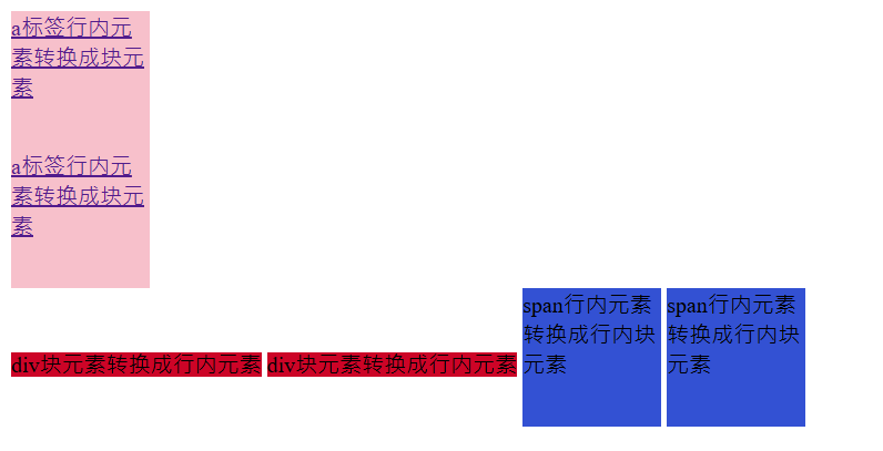
3.4 Snipaste工具使用
Snipaste是一个截图工具,可以让你的截图贴在你的屏幕上。
下载地址:
下载直接解压运行即可
通过网盘分享的文件:Snipaste-2.2.1-Beta2-x64.zip
链接: https://pan.baidu.com/s/1URrgvTlF5MoYMpQUBMgXyw 提取码: d9jd
--来自百度网盘超级会员v10的分享
常用快捷键:
- F1可以截图,同时测量大小,设置箭头,书写文字等。
- F3在桌面置顶显示
- 点击图片,alt可以取色(按下shift键可以切换取色模式)
- 按下esc取消图片显示
3.5 单行文字垂直居中的代码
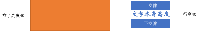
让文字的行高等于盒子的高度 就可以让文字在当前盒子内垂直居中 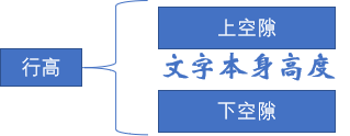
案例演示:
<!DOCTYPE html>
<html lang="en">
<head>
    <meta charset="UTF-8">
    <meta name="viewport" content="width=device-width, initial-scale=1.0">
    <title>Document</title>
    <style>
        .span1 {
            display:block;
            width: 230px;
            height: 40px;
            line-height: 40px;
            background-color: orange;
        }
        .span2 {
            display:block;
            width: 230px;
            height: 40px;
            line-height: 20px;
            background-color: orange;
        }
        .span3 {
            display:block;
            width: 230px;
            height: 40px;
            line-height: 60px;
            background-color: orange;
        }
    </style>
</head>
<body>
    <span class="span1">单行文字居中示例</span>
    <hr>
    <span class="span2">单行文字偏上示例</span>
    <hr>
    <span class="span3">单行文字偏下示例</span>
</body>
</html>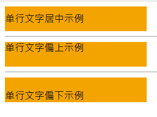
行高的上空隙和下空隙把文字挤到中间了,如果行高小于盒子高度,文字会偏上,如果行高大于盒子高度,则文字偏下。
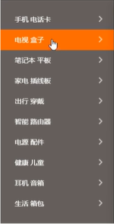
3.6 实战案例-简洁版小米侧边栏
<!DOCTYPE html>
<html lang="en">
<head>
    <meta charset="UTF-8">
    <meta name="viewport" content="width=device-width, initial-scale=1.0">
    <title>Document</title>
    <style>
        a {
            display:block;
            width: 230px;
            height: 40px;
            background-color: #55585a;
            font-size: 14px;
            color: #fff;
            text-decoration: none;
            text-indent: 2em;
            line-height: 40px;
        }
        a:hover {
            background-color: #ff6700;
        }
    </style>
</head>
<body>
    <a href="#">手机 电话卡</a>
    <a href="#">电视 盒子</a>
    <a href="#">笔记本 平板</a>
    <a href="#">家电 插线板</a>
    <a href="#">出行 穿戴</a>
    <a href="#">智能 路由器</a>
    <a href="#">电源 配件</a>
    <a href="#">健康 儿童</a>
    <a href="#">耳机 音响</a>
    <a href="#">生活 箱包</a>
</body>
</html>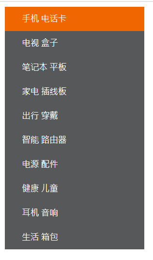
4.CSS的背景
通过 CSS 背景属性,可以给页面元素添加背景样式。
背景属性可以设置背景颜色、背景图片、背景平铺、背景图片位置、背景图像固定等。
4.1 背景颜色
background-color 定义元素的背景颜色
使用方式:
<!DOCTYPE html>
<html lang="en">
<head>
    <meta charset="UTF-8">
    <meta name="viewport" content="width=device-width, initial-scale=1.0">
    <title>Document</title>
    <style>
        div {
            width: 100px;
            height: 100px;
            background-color: pink;
        }
    </style>
</head>
<body>
    <div></div>
</body>
</html>
其他说明:
元素背景颜色默认值是transparent(透明)
background-color: transparent;4.2 背景图片
background-image 定义元素的背景图片
使用方式:
| 属性值 | 描述 | 示例 |
|---|---|---|
none | 无背景图 (默认值) | background-image: none |
url("image.jpg") | 使用绝对或相对路径指定背景图片 | background-image: url("bg.png") |
<!DOCTYPE html>
<html lang="en">
<head>
    <meta charset="UTF-8">
    <meta name="viewport" content="width=device-width, initial-scale=1.0">
    <title>Document</title>
    <style>
        div {
            height: 1000px;
            width: 1000px;
            background-image: url(背景.jpg);
        }
    </style>
</head>
<body>
    <div>背景图片</div>
</body>
</html>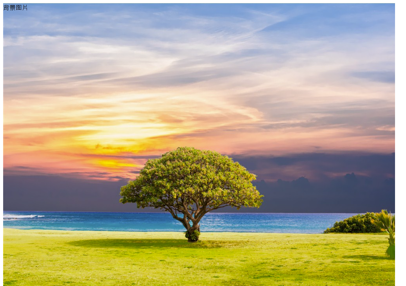
其他说明:
- 实际开发常见于 logo 或者一些装饰性的小图片或者是超大的背景图片, 优点是非常便于控制位置. (精灵图也是一种运用场景)
- 背景图片后面的地址,千万不要忘记加 URL,同时里面的路径不要加引号。
- div设置背景图片的同时还要设置宽高,不然背景图片不显示
4.3 背景平铺
background-repeat 设置元素背景图像的平铺
使用方式:
| 属性值 | 描述 | 示例 |
|---|---|---|
repeat | 背景图像在纵向和横向上平铺 (默认值) | background-repeat: repeat |
no-repeat | 背景图像不平铺 | background-repeat: no-repeat |
repeat-x | 背景图像在横向上平铺 | background-repeat: repeat-x |
repeat-y | 背景图像在纵向上平铺 | background-repeat: repeat-y |
<!DOCTYPE html>
<html lang="en">
<head>
    <meta charset="UTF-8">
    <meta name="viewport" content="width=device-width, initial-scale=1.0">
    <title>Document</title>
    <style>
        div {
            height: 500px;
            width: 500px;
            background-color: aquamarine;
            background-image: url(爱心=focused.png);
            background-repeat: repeat;
        }
    </style>
</head>
<body>
    <div></div>
</body>
</html>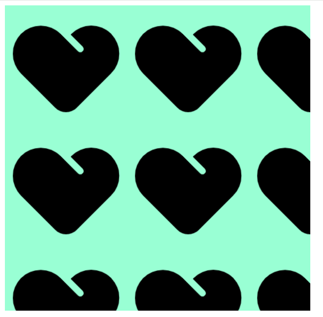
<!DOCTYPE html>
<html lang="en">
<head>
    <meta charset="UTF-8">
    <meta name="viewport" content="width=device-width, initial-scale=1.0">
    <title>Document</title>
    <style>
        div {
            height: 500px;
            width: 500px;
            background-color: aquamarine;
            background-image: url(爱心=focused.png);
            background-repeat: no-repeat;
        }
    </style>
</head>
<body>
    <div></div>
</body>
</html>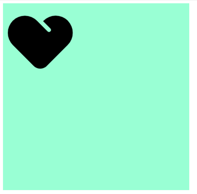
<!DOCTYPE html>
<html lang="en">
<head>
    <meta charset="UTF-8">
    <meta name="viewport" content="width=device-width, initial-scale=1.0">
    <title>Document</title>
    <style>
        div {
            height: 500px;
            width: 500px;
            background-color: aquamarine;
            background-image: url(爱心=focused.png);
            background-repeat: repeat-x;
        }
    </style>
</head>
<body>
    <div></div>
</body>
</html>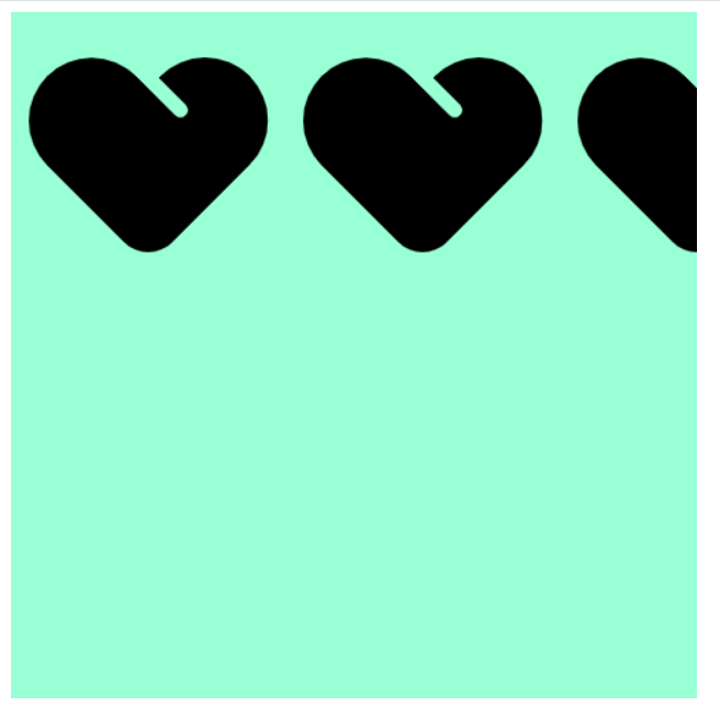
<!DOCTYPE html>
<html lang="en">
<head>
    <meta charset="UTF-8">
    <meta name="viewport" content="width=device-width, initial-scale=1.0">
    <title>Document</title>
    <style>
        div {
            height: 500px;
            width: 500px;
            background-color: aquamarine;
            background-image: url(爱心=focused.png);
            background-repeat: repeat-y;
        }
    </style>
</head>
<body>
    <div></div>
</body>
</html>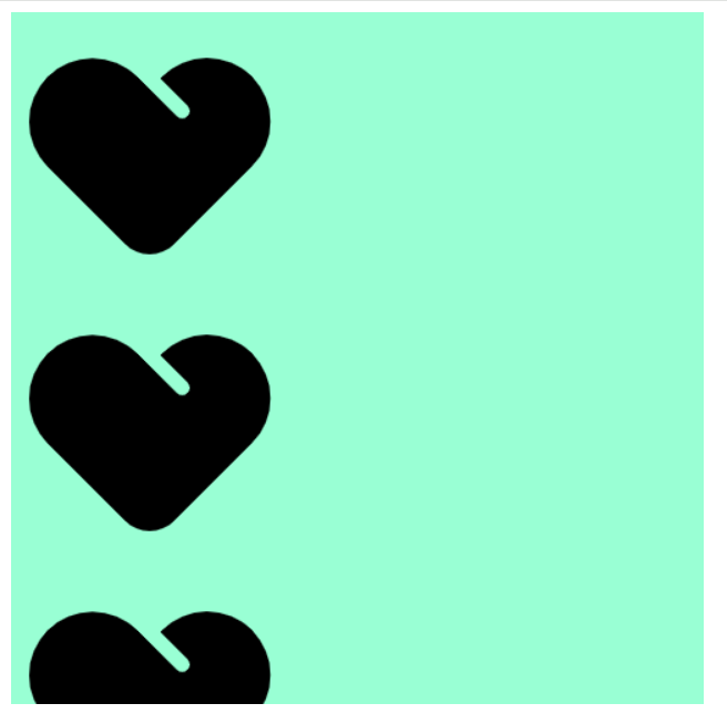
4.4 背景图片位置
background-position 属性可以改变图片在背景中的位置
4.4.1 参数-方位名词
可以使用top、center、bottom、left、right等方位名词
使用方式:
<!DOCTYPE html>
<html lang="en">
<head>
    <meta charset="UTF-8">
    <meta name="viewport" content="width=device-width, initial-scale=1.0">
    <title>Document</title>
    <style>
        div {
            height: 500px;
            width: 500px;
            background-color: aquamarine;
            background-image: url(爱心=focused.png);
            background-repeat: no-repeat;
            background-position: top center;
        }
    </style>
</head>
<body>
    <div></div>
</body>
</html>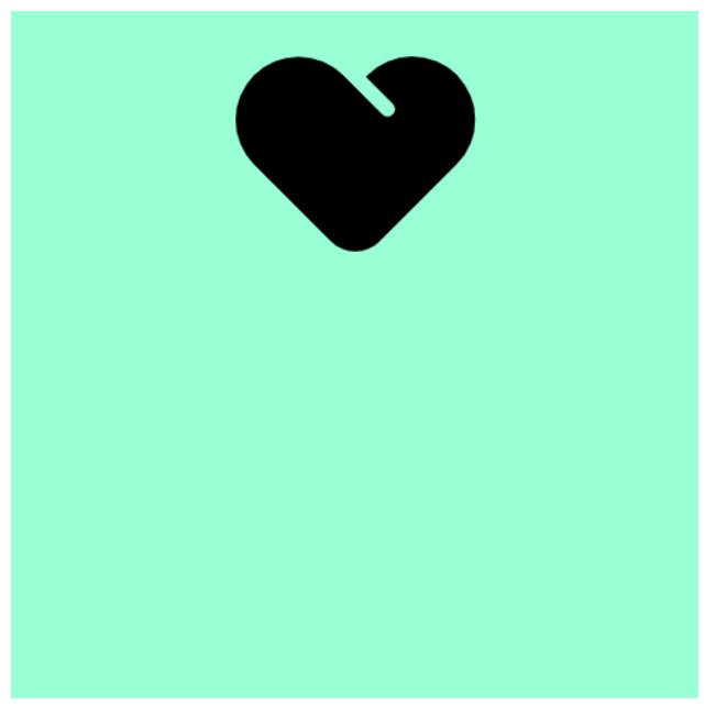
其他说明:
- 如果指定的两个值都是方位名词,则两个值前后顺序无关,比如 left top 和 top left 效果一致
- 如果只指定了一个方位名词,另一个值省略,则第二个值默认居中对齐
使用案例:
- 使用所学知识实现一个用户登录功能
<!DOCTYPE html>
<html lang="en">
<head>
   <meta charset="UTF-8">
   <meta name="viewport" content="width=device-width, initial-scale=1.0">
   <title>Document</title>
   <style>
      h3 {
         width: 120px;
         height: 50px;
         background-color: rgb(192, 255, 201);
         font-size: 14px;
         font-weight: 400;
         line-height: 51px;
         background-image: url(image.png);
         background-repeat: no-repeat;
         background-position: left;
         text-indent: 3em;
      }
      a {
         text-decoration: none;
      }
   </style>
</head>
<body>
<h3><a href="#">用户登录</a></h3>
</body>
</html>
- 完成一个超大背景图片展示
<!DOCTYPE html>
<html lang="en">
<head>
    <meta charset="UTF-8">
    <meta name="viewport" content="width=device-width, initial-scale=1.0">
    <title>Document</title>
    <style>
        body {
            background-image: url(bg.png);
            background-position: top center;
            background-repeat: no-repeat;
        }
    </style>
</head>
<body>

</body>
</html>
4.4.2 参数-精确位置
如果参数值是精确坐标,那么第一个肯定是 x 坐标,第二个一定是 y 坐标
如果只指定一个数值,那该数值一定是 x 坐标,另一个默认垂直居中
<!DOCTYPE html>
<html lang="en">
<head>
    <meta charset="UTF-8">
    <meta name="viewport" content="width=device-width, initial-scale=1.0">
    <title>Document</title>
    <style>
.div1 {
            height: 300px;
            width: 300px;
            background-color: aquamarine;
            background-image: url(爱心=focused.png);
            background-repeat: no-repeat;
            background-position: 20px 50px;
        }
        .div2 {
            height: 300px;
            width: 300px;
            background-color: aquamarine;
            background-image: url(爱心=focused.png);
            background-repeat: no-repeat;
            background-position: 50px 20px;
        }
    </style>
</head>
<body>
    <div class="div1"></div>
    <hr>
    <div class="div2"></div>
</body>
</html>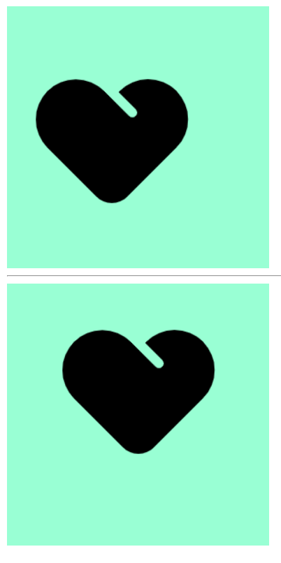
4.4.3 参数-混合单位
如果指定的两个值是精确单位和方位名词混合使用,则第一个值是 x 坐标,第二个值是 y 坐标
<!DOCTYPE html>
<html lang="en">
<head>
    <meta charset="UTF-8">
    <meta name="viewport" content="width=device-width, initial-scale=1.0">
    <title>Document</title>
    <style>
.div1 {
            height: 300px;
            width: 300px;
            background-color: aquamarine;
            background-image: url(爱心=focused.png);
            background-repeat: no-repeat;
            background-position: 10px center;
        }
        .div2 {
            height: 300px;
            width: 300px;
            background-color: aquamarine;
            background-image: url(爱心=focused.png);
            background-repeat: no-repeat;
            background-position: center 10px;
        }
    </style>
</head>
<body>
    <div class="div1"></div>
    <hr>
    <div class="div2"></div>
</body>
</html>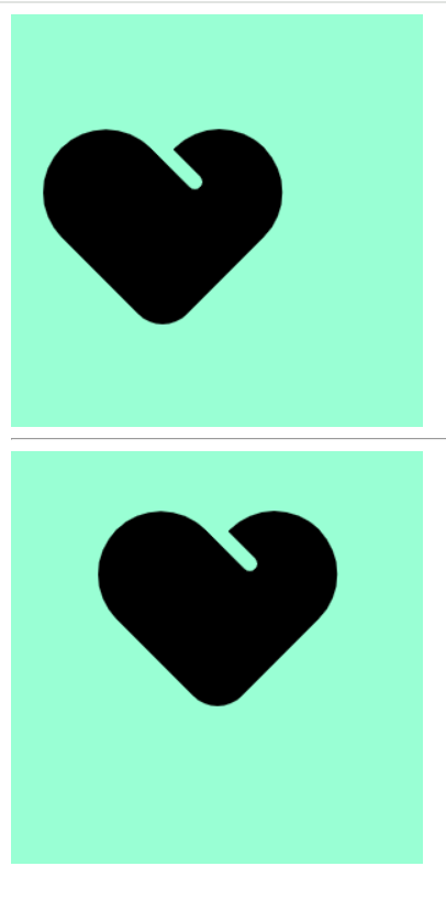
4.5 背景图片固定
background-attachment 属性设置背景图像是否固定或者随着页面的其余部分滚动。
使用方式:
| 属性值 | 描述 | 示例 |
|---|---|---|
scroll | 背景图像随页面内容滚动 (默认值) | background-attachment: scroll |
fixed | 背景图像固定在视口中 | background-attachment: fixed |
local | 背景图像随元素内容滚动 | background-attachment: local |
<!DOCTYPE html>
<html lang="en">
<head>
    <meta charset="UTF-8">
    <meta name="viewport" content="width=device-width, initial-scale=1.0">
    <title>Document</title>

    <style>
        body {
            background-image: url(bg.png);
            background-position: top center;
            background-repeat: no-repeat;
            background-attachment: fixed;
        }
    </style>
</head>
<body>

    <p>背景图片固定演示</p>
    <p>背景图片固定演示</p>
    <p>背景图片固定演示</p>
    <p>背景图片固定演示</p>
    <p>背景图片固定演示</p>
    <p>背景图片固定演示</p>
    <p>背景图片固定演示</p>
    <p>背景图片固定演示</p>
    <p>背景图片固定演示</p>
    <p>背景图片固定演示</p>
    <p>背景图片固定演示</p>
    <p>背景图片固定演示</p>
    <p>背景图片固定演示</p>
    <p>背景图片固定演示</p>
    <p>背景图片固定演示</p>
    <p>背景图片固定演示</p>
    <p>背景图片固定演示</p>
    <p>背景图片固定演示</p>
    <p>背景图片固定演示</p>
    <p>背景图片固定演示</p>
    <p>背景图片固定演示</p>
    <p>背景图片固定演示</p>
    <p>背景图片固定演示</p>
    <p>背景图片固定演示</p>
    <p>背景图片固定演示</p>
    <p>背景图片固定演示</p>
    <p>背景图片固定演示</p>
    <p>背景图片固定演示</p>
    <p>背景图片固定演示</p>
    <p>背景图片固定演示</p>
    <p>背景图片固定演示</p>
    <p>背景图片固定演示</p>
    <p>背景图片固定演示</p>
    <p>背景图片固定演示</p>
    <p>背景图片固定演示</p>
    <p>背景图片固定演示</p>
    <p>背景图片固定演示</p>
    <p>背景图片固定演示</p>
    <p>背景图片固定演示</p>
    <p>背景图片固定演示</p>
    <p>背景图片固定演示</p>
    <p>背景图片固定演示</p>
    <p>背景图片固定演示</p>
    <p>背景图片固定演示</p>
    <p>背景图片固定演示</p>
    <p>背景图片固定演示</p>
    <p>背景图片固定演示</p>
    <p>背景图片固定演示</p>
    <p>背景图片固定演示</p>
    <p>背景图片固定演示</p>
    <p>背景图片固定演示</p>
    <p>背景图片固定演示</p>
    <p>背景图片固定演示</p>
    <p>背景图片固定演示</p>
    <p>背景图片固定演示</p>
    <p>背景图片固定演示</p>
    <p>背景图片固定演示</p>
    <p>背景图片固定演示</p>
    <p>背景图片固定演示</p>
    <p>背景图片固定演示</p>
    <p>背景图片固定演示</p>
    <p>背景图片固定演示</p>
    <p>背景图片固定演示</p>
    <p>背景图片固定演示</p>
    <p>背景图片固定演示</p>
    <p>背景图片固定演示</p>
    <p>背景图片固定演示</p>
    <p>背景图片固定演示</p>
    <p>背景图片固定演示</p>

</body>
</html>
其他说明:
background-attachment 后期可以制作视差滚动的效果。
4.6 背景样式合写
background: 背景颜色 背景图片地址 背景平铺 背景图像滚动 背景图片位置;
使用方式:
<!DOCTYPE html>
<html lang="en">
<head>
    <meta charset="UTF-8">
    <meta name="viewport" content="width=device-width, initial-scale=1.0">
    <title>Document</title>

    <style>
        body {
            background: url(bg.png) top center no-repeat fixed;
        }
    </style>
</head>
<body>
    <p>背景合写演示</p>
</body>
</html>
4.7 背景色半透明
CSS3 提供了背景颜色半透明的效果。
使用方式:
- 最后一个参数是 alpha 透明度,取值范围在 0~1之间
- 我们习惯把 0.3 的 0 省略掉,写为 background: rgba(0, 0, 0, .3);
<!DOCTYPE html>
<html lang="en">
<head>
    <meta charset="UTF-8">
    <meta name="viewport" content="width=device-width, initial-scale=1.0">
    <title>Document</title>
    <style>
        div {
            height: 300px;
            width: 300px;
            background: rgba(0, 0, 0, 0.3);
        }
    </style>
</head>
<body>
    <div></div>
</body>
</html>
注意事项:
- 背景半透明是指盒子背景半透明,盒子里面的内容不受影响
- CSS3 新增属性,是 IE9+ 版本浏览器才支持的,但是现在实际开发,我们不太关注兼容性写法了,可以放心使用
4.8 背景总结
| 属性 | 作用 | 值 |
|---|---|---|
| background-color | 背景颜色 | 颜色值/transparent |
| background-image | 背景图片 | none/url() |
| background-repeat | 背景平铺 | repeat/no-repeat/repeat-x/repeat-y |
| background-position | 背景位置 | 方位名词(top/center/bottom/left/right) 或 精确坐标(x y) |
| background-attachment | 背景附着 | scroll(滚动)/fixed(固定) |
| background | 背景简写 | 颜色 图片 平铺 滚动 位置 (顺序无强制要求) |
| background:rgba() | 背景色半透明 | rgba(红,绿,蓝,透明度) 透明度0-1 |
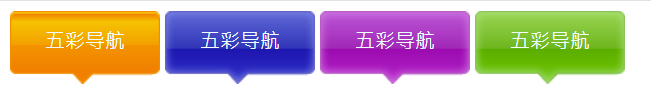
5.综合案例
根据所学知识实现一个鼠标放上去会变样式的导航栏
<!DOCTYPE html>
<html lang="en">
<head>
   <meta charset="UTF-8">
   <meta name="viewport" content="width=device-width, initial-scale=1.0">
   <title>Document</title>
   <style>
      .nav a {
         display: inline-block;
         height: 58px;
         width: 120px;
         background-color: pink;
         text-align: center;
         line-height: 48px;
         color: azure;
         text-decoration: none;
      }
      .nav .a1 {
         background: url(images/bg1.png) no-repeat;
      }
      .nav .a1:hover {
         background-image: url(images/bg2.png);
      }
      .nav .a2 {
         background: url(images/bg3.jpg) no-repeat;
      }
      .nav .a2:hover {
         background-image: url(images/bg3.png);
      }
      .nav .a3 {
         background: url(images/bg4.png) no-repeat;
      }
      .nav .a3:hover {
         background-image: url(images/bg5.png);
      }
      .nav .a4 {
         background: url(images/bg22.png) no-repeat;
      }
      .nav .a4:hover {
         background-image: url(images/bg11.png);
      }
   </style>
</head>
<body>
<div class="nav">
   <a href="#" class="a1">五彩导航</a>
   <a href="#" class="a2">五彩导航</a>
   <a href="#" class="a3">五彩导航</a>
   <a href="#" class="a4">五彩导航</a>
</div>
</body>
</html>